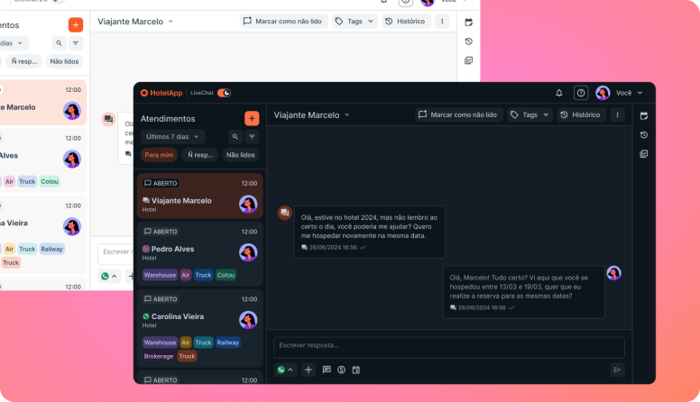
LiveChat in light mode (back) and in the new dark mode (front). The interface is in Portuguese: Atendimentos (Conversations), Marcar como não lido (Mark as unread), Histórico (History), Escrever resposta… (Write a reply…).
Dark Mode: Designing a Token System to Improve Satisfaction
How I led the design of a project identified through the CSAT survey (17 votes for "screen colors"), structured a system of 470+ design tokens with engineering and the product manager, and shipped it in 2 weeks — resulting in +11pp overall CSAT and +14pp in the Enterprise segment, with 33% adoption and sustained retention.
DISCLAIMER: Sorry, dear reader: the project is real, but this text was written by AI and it's a pretty boring read… I'm rewriting my case studies with my own two handz, I just can't leave this page empty. It's still a great case — just a bit dull to read.
Role: Product Designer Lead
Responsibilities: Strategic leadership, system design, alignment with Dev and PM
Impact: +11pp overall CSAT | +14pp Enterprise CSAT | 33% adoption and retention
Timeline: 2 weeks of implementation | Validated in Q1 2025
Team: Michel (Product Design Lead) + Product Manager + Engineers
Context: Project identified through the reformulated CSAT survey, prioritized for measurable impact
The Problem: Data That Created an Opportunity
Insight from the Reformulated CSAT Survey
Between December 2024 and January 2025, the satisfaction survey (which we had redesigned for greater granularity) showed:
| Ranking | Macro subject | Votes | % |
|---|---|---|---|
| 🥇 1st | Screen design | 56 | 23% |
| 2nd | Being easier to use | 51 | 21% |
| 3rd | Speed of actions | 41 | 17% |
| 4th | New features | 36 | 15% |
| 5th | Bug fixes | 36 | 15% |
| 6th | Archiving | 15 | 6% |
Within "Screen design", the most critical subtopic:
| Ranking | Subtopic | Votes |
|---|---|---|
| 🥇 1st | Too much information | 18 |
| 🥈 2nd | The screen colors | 17 |
| 3rd | Spacing between elements | — |
The Context Behind the Data
The interface was mostly white (#FFF), which might be acceptable for a product used occasionally. But this was the agents' main work tool:
- ⏰ 7+ hours a day of continuous use
- 🌑 Low-light environments (contact centers)
- 🎯 Intense contrast causing visual discomfort
- 🚨 Event colors outside the standard palette (e.g. green background + white text = inaccessible)
Qualitative Validation
Spontaneous user feedback confirmed the problem:
- "It really strains my eyes"
- "The interface is way too white"
- "Headache after using it for a long time"
- Enterprise customers reported the same discomfort
Conclusion: This wasn't an isolated issue. It was a shared pain that affected multiple user segments and was measurable in the data.
The Strategy: Beyond Dark Mode
Stakeholder Alignment
Before designing anything, the work was alignment:
With the PM:
- "We have 17 votes for 'screen colors' — it's the 2nd most mentioned problem"
- "If we build it, we expect to see this metric drop significantly in the next CSAT"
- "It also improves the perceived quality of the product"
With Engineering:
- "Can we do this in 2 weeks?"
- "What's the best strategy — tokens or a component refactor?"
- "We need to keep Light Mode compatible while we build"
Result: Consensus that design tokens were the right path — enabling a fast launch + future scalability.
The Challenge Wasn't Just Creating a Dark Theme
- ✅ Launch Dark Mode quickly (2 weeks)
- ✅ Keep visual consistency across both themes
- ✅ Allow future customization (corporate color changes)
- ✅ Improve Light Mode colors as well
- ✅ Sync design (Figma) with development (Nebular/Angular)
Approach: Design Tokens (Inspired by Atlassian)
We adopted a design token architecture based on the structure of the Atlassian Design System:
Before:
- 31 color tokens (a limited, inflexible system)
- Colors hard-coded directly into components
- Impossible to change themes without a full refactor
After:
- 470+ tokens in total
- 192 primitive tokens (base colors)
- Hierarchical structure: Primitives → Semantic → Components
- Dynamic themes (Light/Dark with real-time switching)
Technical Implementation
Stack: Nebular (Angular UI kit) with theme-based customization
Design ↔ Engineering collaboration:
The key was synced decision-making. Instead of Design handing over specs and Engineering implementing them, we:
- Design defined the token model (inspired by Atlassian)
- Engineering validated feasibility (possible in 2 weeks? yes, with the right strategy)
- Design + Engineering defined the mapping (which old color becomes which new token)
Fast launch strategy: To make it happen in 2 weeks, we didn't refactor everything at once. Instead:
- We mapped old tokens → new ones (HEX by HEX)
- The library automatically translated them to Dark Mode
- This enabled a fast launch while we consolidated the system
- The full refactor would come later, without pressure
Old color (#FFF) → New token (color-background-neutral-100-light)
                 → Dark Mode token (color-background-neutral-900-dark)
Results: Clear Validation
Metric 1: Adoption & Retention
- ✅ 33% adoption across all users
- ✅ High retention — people kept using it after launch
- ✅ Not a "nice to have", but a feature people want to keep
Metric 2: CSAT (Before vs After)
Before Dark Mode (Dec 1 – Jan 1):
| Segment | Respondents | CSAT |
|---|---|---|
| Overall | 395 | 64.30% |
| Enterprise | 207 | 65.22% |
After Dark Mode (Mar 1 – Apr 1):
| Segment | Respondents | CSAT | Delta |
|---|---|---|---|
| Overall | 421 | 75.77% | +11.47pp |
| Enterprise | 223 | 79.37% | +14.15pp |
Metric 3: Shift in Feedback Priorities
The real test: "Screen design" (the problem that motivated the project) dropped dramatically:
Before (top 6 subtopics):
| Ranking | Subtopic | Votes |
|---|---|---|
| 1st | Too much information | 18 |
| 2nd | The screen colors | 17 |
| 3rd | Could be easier | 16 |
| 4th | Sending messages (speed) | 12 |
| 5th | Chat/History | 9 |
| 6th | Quotes | 9 |
After (top 6 subtopics):
| Ranking | Subtopic | Votes | Change |
|---|---|---|---|
| 1st | Sending messages (speed) | 11 | — |
| 2nd | Chat/History | 8 | — |
| 3rd | Too much information | 7 | ↓ -61% |
| 4th | Sending messages (bugs) | 6 | — |
| 5th | Opening the platform | 5 | — |
| 6th | The screen colors | 3 | ↓ -82% |
Macro subjects (Before → After):
| Subject | Before (votes) | After (votes) | Change |
|---|---|---|---|
| Screen design | 56 (1st place) | 18 (5th place) | ↓ -68% |
| Bug fixes | 36 (4th place) | 31 (1st place) | ↑ New priority |
| Speed of actions | 41 (3rd place) | 30 (2nd place) | Stable |
Interpretation: The problem was solved. The survey now surfaces the next problems.
Secondary Impacts (Unplanned, but Valuable)
1. Side Improvement in Light Mode
With the new token structure, Light Mode colors improved too:
- Better contrast
- A more consistent palette
- A benefit for every user, not just those on Dark Mode
2. Design System Scalability
"If the corporate color changes to blue tomorrow, we update the entire platform by changing a single HEX"
- A fully parameterizable system
- Future-proof for branding changes
3. Code–Design Sync
Precision when building new features increased because:
- Code is paired with Figma
- Tokens are consistent between design and implementation
- Fewer discrepancies and visual bugs
Key Learnings
For a Product Designer in a Leadership Role:
- Well-structured research produces a clear, defensible roadmap
- The reformulated CSAT pinpointed "screen colors" precisely
- PM and engineering could trust the data to prioritize
- Without data, the conversation would have been "I think dark mode would be nice"
- Early alignment is critical
- Conversation with the PM: "What's the expected impact?"
- Conversation with Eng: "What's technically feasible?"
- Result: the design tokens decision (which wasn't obvious at first)
- Trade-offs need to be explicit
- "We can do a full refactor in 4 weeks OR launch in 2 weeks with mapping"
- We chose the second. The refactor will come later with less pressure
- That's product thinking, not just design thinking
- Design tokens are leadership assets
- It's not "just design". It's infrastructure that enables:
- Future branding changes
- Consistency across themes
- Engineering autonomy on new features
- As a Product Lead, you create assets that multiply the team's impact
- It's not "just design". It's infrastructure that enables:
For Design + PM + Engineering Collaboration:
- Quantifiable data is a bridge between disciplines
- PM understands: "17 votes means priority"
- Eng understands: "2 weeks is feasible with this approach"
- Design understands: "This solves a real problem"
- Design-tech decisions need to be collaborative from the start
- If design says "we want 500 tokens" and eng says "not in 2 weeks", that's a problem
- If eng says "HEX mapping" and design says "it doesn't work visually", that's a problem
- The "mapping now + refactor later" decision came out of a conversation, not one side imposing on the other
- Shared metrics align the team
- Before: Design wants to improve, PM wants CSAT, Eng wants clean code (conflicts)
- After: the whole team wants to see "screen colors" drop from 2nd to 6th place
- A unified metric aligns incentives
- A fast launch with quality is possible
- It takes clarity (tokens, not hacks)
- It takes collaboration (design ↔ eng iterating)
- It takes conscious trade-offs (mapping now, refactor later)
For Product (Feature Direction):
- Quantifiable insights are defensible
- "17 votes for 'screen colors'" justifies 2 weeks far better than "we think it'd be nice"
- Structured data enables fast iteration
- With the old survey, it would have taken months
- With granularity, it was clear within 30 days
- Features can be validated through feedback
- 33% adoption + an 82% drop in the problem = full validation
- It's not assumed — it's measured
Technical Token Structure (For Context)
Tier 1: Primitives (base)
├── color-neutral-50 (#FFFFFF - Light)
├── color-neutral-900 (#1a1a1a - Dark)
├── color-primary-500 (#667eea)
└── ... (+192 primitive tokens)

Tier 2: Semantic (meaning)
├── color-background-default (uses color-neutral-50 in Light, color-neutral-900 in Dark)
├── color-text-primary (uses color-neutral-900 in Light, color-neutral-50 in Dark)
├── color-border-subtle
└── ...
With just Primitives + Semantic tokens, we were able to transform the entire look of the interface without changing a single Angular component.
Conclusion
Dark Mode was much more than a visual "nice to have". It was practical proof that a well-structured survey produces actionable insights.
The survey identified the problem (colors), we prototyped the solution (Dark Mode), and the data confirmed it worked (CSAT +11pp, problem down 82%).
A complete cycle of data-driven product design.